Review by Graham Johnstone
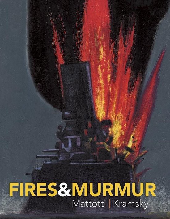
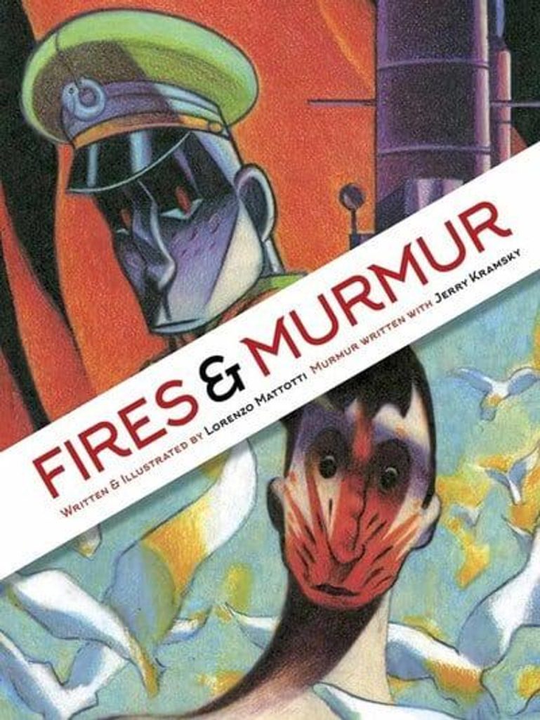
Lorenzo Mattotti was rightly acclaimed for his 1986 graphic novel Fires. Groundbreaking in its time, there’s still little to compare, beyond the Italian maestro’s handful of other books. By 2017, both Fires and 1989’s Murmur had been out of print (in English) for twenty-odd years, making this combined reprint very welcome.
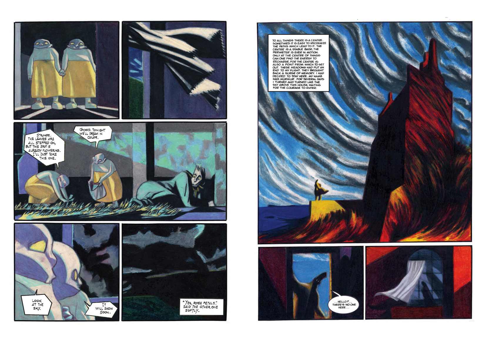
Created before comics were coloured with Photoshop, these pages appear to be achieved with coloured pencil and oil pastels. Mattotti is a rare comics artist who liberates colour from black outlines. Here, a few figures are inked. Visually, they jar, but at least draw attention to the right elements. He draws directly on early modern painting: the writhing energy of Expressionism, and the bold colours of Fauvism. Yet Mattotti is no mere imitator, drawing inspiration across styles to suit each image, with the result seamlessly his own. Landscapes undulate, and life-forms writhe in Art Nouveau curves. Figures are distorted by the elements, or become monumental sculptures amongst inter-war architecture. Moods range from gothic storm-scape to beach idyll, with palettes to match. An image as mundane as someone tidying a kitchen is dazzling. These pages could be hung in galleries amongst the masterpieces of 20th Century modernism.
Fires, like the film Apocalypse Now, is a loose riff on out-of-copyright classic Heart of Darkness. Instead of a merchantman sailing upriver, Mattotti has a battleship arriving at fictional island St Agatha. They are tasked to ‘civilise’ it, so retaining the colonial assumption of superiority that will be tested. The fires of the title, are seen from the ship at night, and said in legend to be the breath of St Agatha herself. Lieutenant Absinthe is already feeling strangely drawn to the island, when he is ordered to lead the first landing. The experience is hallucinatory and intense. Separated from his men, he thinks he glimpses a figure through the undergrowth. Back on the ship however, he reports to the Captain that the island is uninhabited, and there is nothing to report. That night the island fills his dreams, and he volunteers for the next expedition…
The minimal plot is a perfect vehicle for Mattotti’s visual imagination. There’s a beautiful geometry to the guns and turrets, and the men lined up in uniform. This is in stark contrast to the island scenes – all light and colour, organic shapes, at times bordering on complete abstraction. Every panel is a thing of beauty. Yet this is no mere set of static pictures, they suck us forward in the story. We experience the grip of the island as much as Absinthe.
For Murmur, Mattotti enlists writer Jerry Kramsky. This duo went on to create the masterpiece Dr. Jekyll and Mr. Hyde, but Murmur feels a faltering early effort. Without a classic story to riff off, it’s meandering. There’s no explanation of how the pair collaborated, but it reads as if Kramsky wrote the text for drawn pages. Perhaps Kramsky, awed by Mattotti’s art, was trying too hard to assert his contribution. His text feels an intrusive bolt-on, with leaden prose, intrusive over-narration, and general verbiage. The result reads as if written in one late-night, frenzied burst, and never revisited in the light of day. Thankfully, Mattotti’s art is as brilliant as ever. The ending is oblique, yet satisfying, and highly visual, inspiring some of the books most memorable images.
This 2017 hardback loses some page size over the individual 1990s editions, but is well worth the money for Fires alone, with the flawed but beautiful Murmur a very welcome bonus.