Review by Frank Plowright
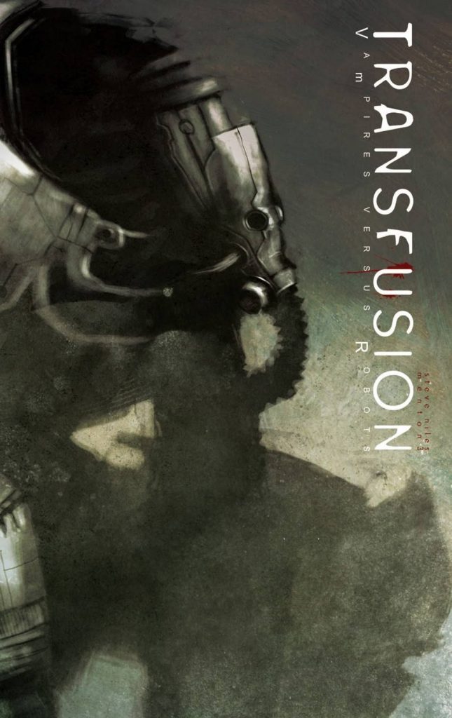
When Transfusion was published in 2013 IDW had already found considerable success with the Zombies vs Robots franchise, and their initial big push had been with Steve Niles’ 30 Days of Night, featuring an original twist on the idea of vampires. It wasn’t that great a leap, then, to have Niles give the idea of vampires another twist, this time recasting them as robots in the future surviving on human blood.
Niles, however, does more than that, keeping a surprise in store for when it’s assumed readers will have become comfortable with the situation. It’s a good surprise, emphasising the lack of humanity remaining, and how important they are to others. He knows when he’s onto a good thing, and takes an even more stripped down approach to the narrative than he did in 30 Days of Night, leaving the art to tell much of the story, and that’s when Transfusion hits the speed bumps.
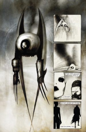
Primary artist Menton3 (Menton J. Matthews III) takes the same sparse approach to the art as Ben Templemsith did for 30 Days of Night, but doesn’t have Templesmith’s imagination or page design skills. The surface is there, but the storytelling is basic, and the visual eccentricities aren’t part of a cohesive artistic vision, but plastered over. It shows up that Menton3 isn’t very good at drawing people, and the digitally rendered 3D pages intrude badly into the scratchy pen and ink. The background is snow, and his art is at its best when he’s providing silhouettes set against the whiteness, while other individual panels also strike a chord. Tony Moy takes over for the final chapter, and is stuck with the awkward artistic fusion already established, and why there are several black and white pages in the middle of that final chapter is anyone’s guess.
While Niles provides a decent enough story, the emphasis on mood requires more imaginative art to bring it fully to life, and the robots, the most visually interesting presences, are relegated to bit players. The end result is still readable, but not as readable as it might have been.
