Review by Frank Plowright
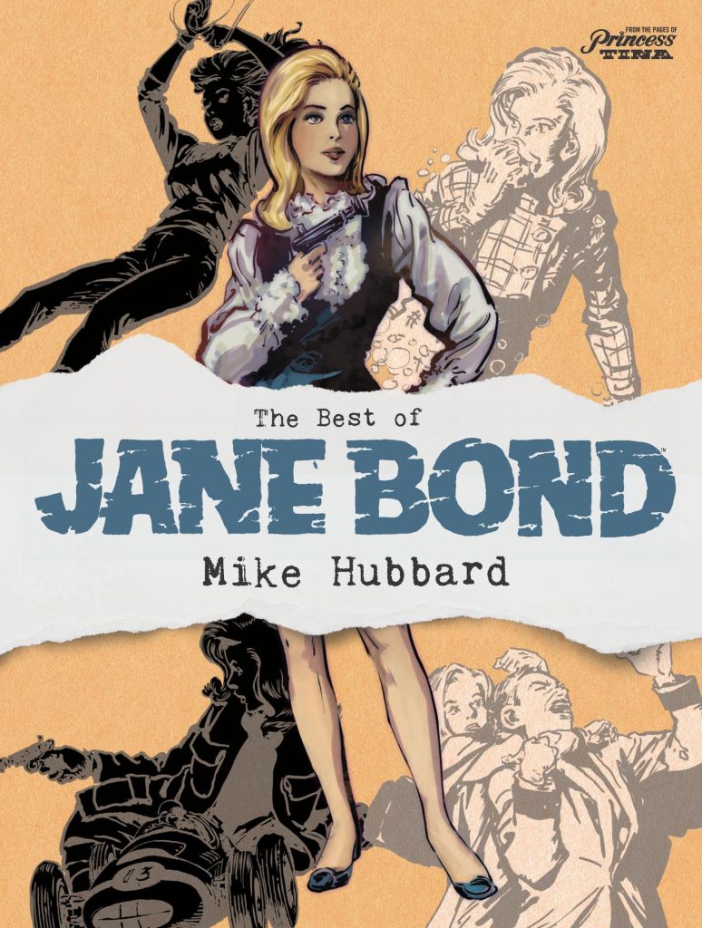
Mike Hubbard is an artist unknown to most readers despite working in British comics from the 1930s to early 1970s, and based on The Best of Jane Bond he’s someone who should be more widely known. Let’s be thankful, then, for the diligence of comics historian David A. Roach in finding the original artwork and ensuring a collection of Hubbard’s longest running comics assignment.
A strip titled Jane Bond has obvious origins in 1967, but in a less knowing world it supplied a weekly dose of refined glamour to the girl readers of Tina, a comic designed to be more attuned to the era. The writer is sadly unknown, but drops names of products, fashion and locations associated with sophistication. Jane herself is first seen on a Los Angeles racetrack, a driving daredevil establishing her credentials as a risk taker. She works for Worldpol, and intervenes in matters threatening global security. As in the James Bond novels (as opposed to films) these are largely credible threats only slightly exaggerated by arch villains. An example is the lobster-keeping chemist who’s developed a crop-destroying substance and is blackmailing farmers.
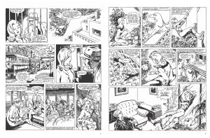
By the time he came to draw Jane Bond Hubbard was in his mid-sixties, as was the era, and that combination means elements of the strip have inevitably aged, but what hasn’t is the timeless draughtsmanship. As Roach’s introduction notes, this is technique comparable to the best newspaper artists of the era, and it’s lost to history why Hubbard drew the erotica of the Jane newspaper feature, but then moved into comics. His work features impeccable storytelling, glamour and fully detailed settings, and as icing on the cake, each two page strip begins with a beautifully composed grey wash panel. Hubbard gave considerable thought to what he drew, keeping it relatively realistic within the parameters of a secret agent strip. It’s noticeable that Jane almost always wears flat shoes, far more practical for running and fighting when necessary, although it’s also apparent that in later strips Hubbard moves the standard viewpoint in a little so as not to draw feet. One big surprise is a risque sequence early on where Hubbard uses shading suggestively, but otherwise strips with Jane in a bikini have an innocence rather than sexual allure.
As the strip progresses the ideas become slightly more detached from reality, but that offers Hubbard greater visual opportunities, such as the surroundings of a travelling circus where a spy is hiding or a strip set largely in a submarine. That features what was considered fantasy at the time, but the threat of the Arctic ice melting is now exceedingly relevant.
While the plots do their job, they’re competent adventure with an interesting leading character, but no more, and it’s the art that survives to be greatly admired.
