Review by Ian Keogh
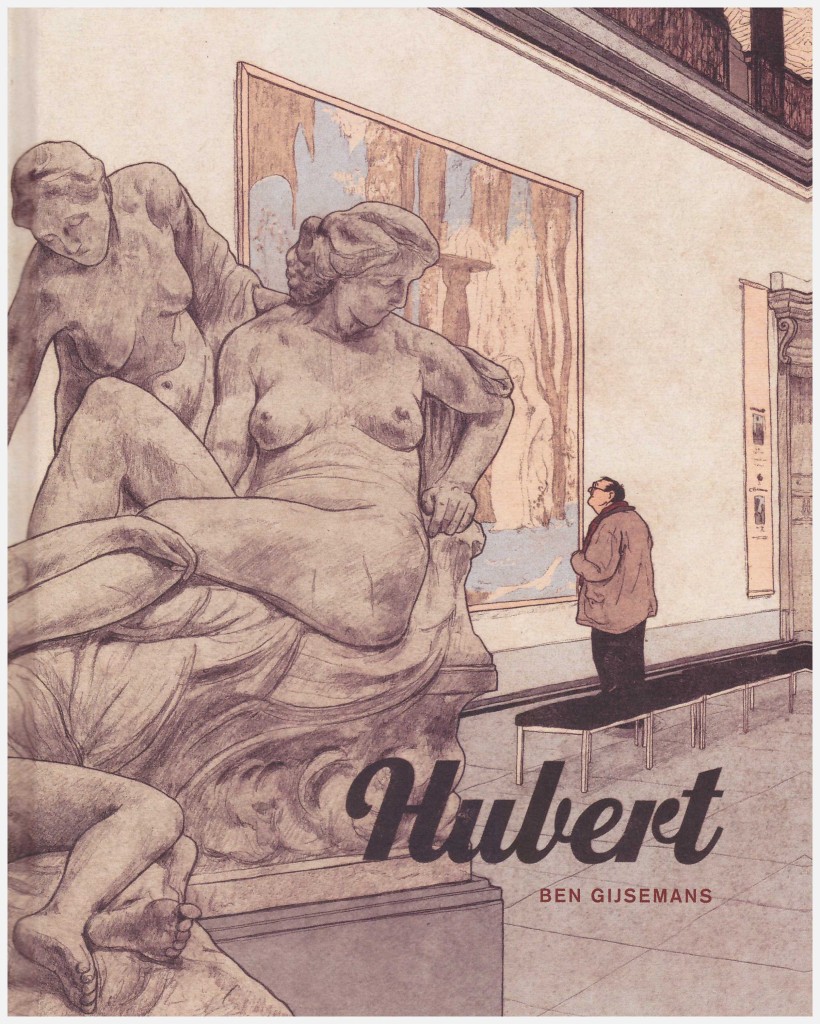
Hubert is a puzzling graphic novel, and it’s difficult to know what to admire most, Ben Gijsemans’ prodigious artistic talent or his dedication to this ponderous project.
Hubert is a lonely middle-aged man whose introverted character only comes to life when confronted by the classical beauty of the past. Living in Belgium, he maintains a spartan existence, yet travels considerable distances to visit museums and art galleries hosting great works. He also attempts to replicate these paintings in his rented studio flat, puzzling over detail and technique. He avoids interaction with the wider world, but when forced he’s diffident and awkward, a man incapable of conversation about anything other than his solitary passion.
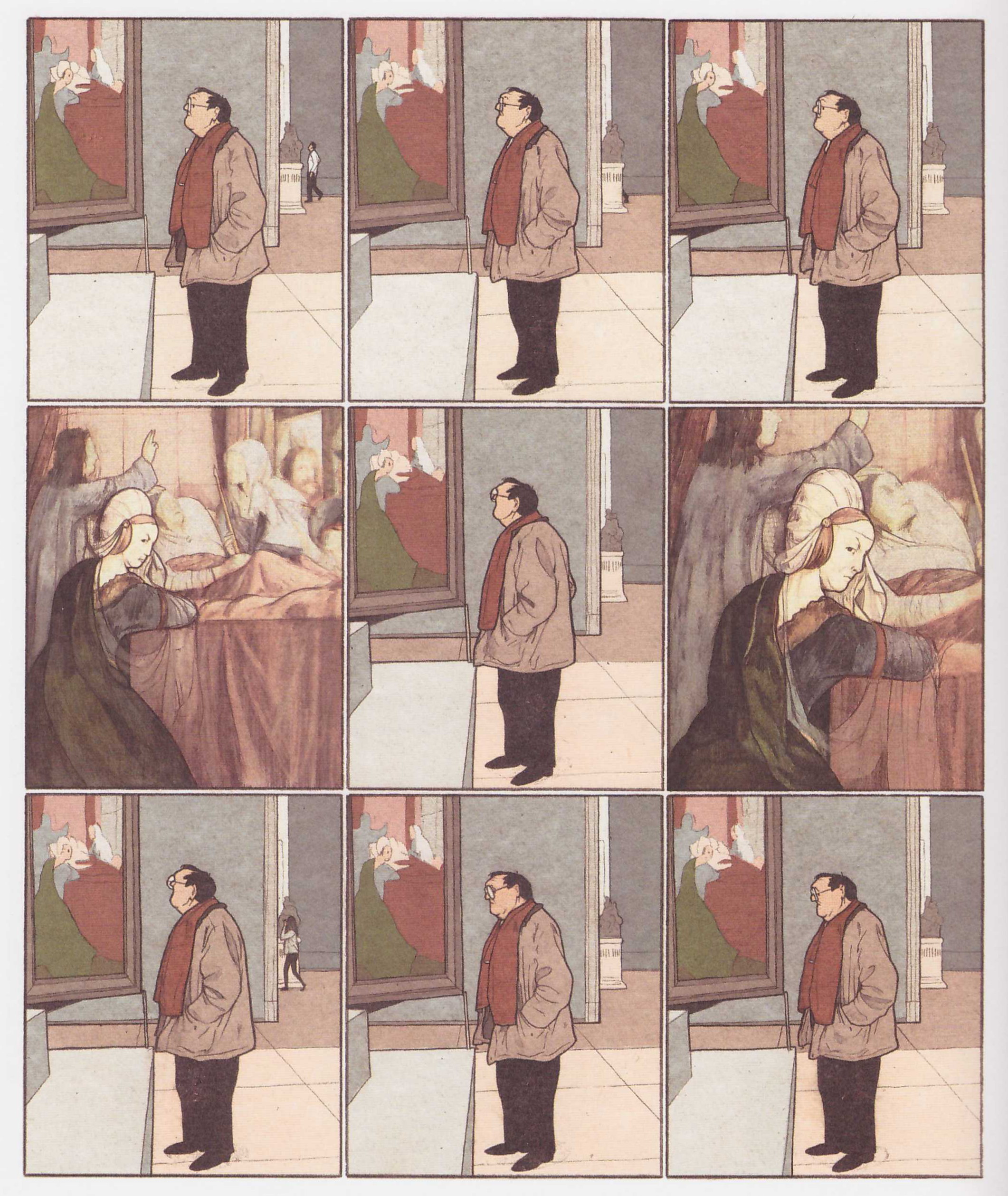
The limited parameters of Hubert’s world are stunningly depicted by Gijsemans, for the most part nine intricately drawn frames to the page, some sequences depicting as little as Hubert moving from his armchair to his table. Other panels focus on the small, unchanging, details of his life, such as his preferred television viewing, which is similarly rooted in the past, although one less distant. There’s something of Winsor McCay about the delicacy of his line, which is extraordinary. Gijsemans’ presentation of the great works of classical art providing the backdrop to Hubert’s life is equally impressive, their confident beauty contrasting Hubert’s own concealed personality. A single spread where Gijsemans moves away from his disciplined grid is in order to present the modern city as Hubert experiences it: a confusing melange of banal technology and architecture.
Gijsemans has a point to make about modern day isolation, and his deliberately slow presentation is presumably intended to reinforce the mood, to replicate for the reader the tedium and loneliness of life as experienced by many city residents. Is there a requirement, though, to duplicate it in such painstaking fashion to prompt an understanding? The downbeat mood is further emphasised by Gijsemans’ choice of colours, which are faded and autumnal, reflecting the autumn of Hubert’s life.
Those able to immerse themselves in Hubert’s world, to experience his loneliness, will take far more from this than anyone else with eyes able to appreciate Gijsemans’ exceptional art. His career progress will be well worth monitoring.