Review by Ian Keogh
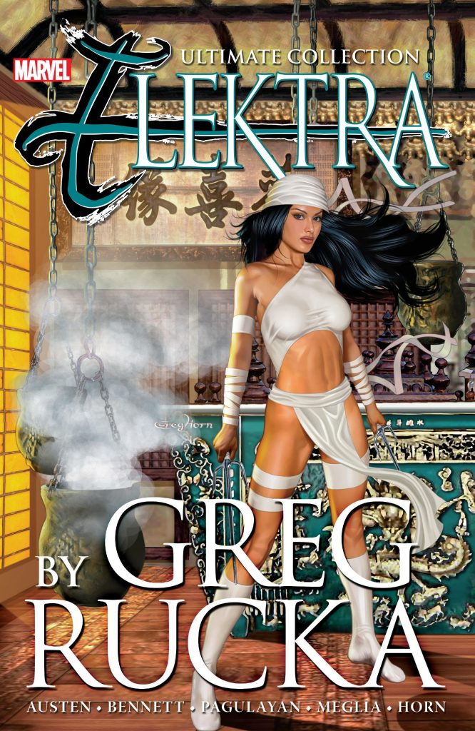
Greg Horn’s version of Elektra stands out as an attempt to look behind the usual portrayal of the heartless murder machine and consider why she’s that way. This bulky paperback combines the out of print collections Introspect and Everything Old is New Again, but adds the three part story that began Horn’s run.
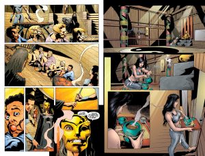
The first two episodes are drawn by Chuck Austen, and not very well, with strangely proportioned, elongated figures and poor use of light and shade. Joe Bennett (sample art left) also has problems with figures, although to nowhere near the same degree as Austen, but his layouts and placement of background details is infinitely preferable and he concludes a story with a moral message well. That and the following short are the nearest Rucka comes to the traditional Elektra, defining there are lines she won’t cross, but presenting her as in control and infinitely resourceful. That short story is illustrated by Greg Horn in the digitally manipulated, photo-realistic style loved by many. It now looks primitive and plastic, the panels lacking depth and the people stiffly posed.
A real gem follows Horn, as Bennett illustrates a day in Elektra’s life as she returns to New York. Rucka lets the art tell most of the story, but it encapsulates his view of Elektra as careful, alluring and dangerous beyond compare. The reasons for that, however, are intimately entwined with her past associations, and Rucka also presents her as defined by a need to kill. This is in a chapter that doesn’t convince, with Elektra falling to pieces over time when unemployment is hard to come by. Being true to Rucka’s depiction, wouldn’t she just start killing those who offended her ethics rather than crumble entirely? This is a means to an end, with Rucka first having a story where Elektra’s vulnerability has her captured, and then presenting his version of the martial arts movie plot where to gain true knowledge the past must be confronted and defeated. Both are good action thrillers if you can accept the reasoning behind them.
Two further artists contribute, with wildly contrasting styles. Carlos Meglia’s cartooning prioritises chunky, angular figures and sometimes crowded pages resembling street art in places, with Elektra’s breasts each the size of her head. It’s too great a contrast with the other art used on the same story. What was the editor thinking? Carlo Pagulayan draws more pages than the other artists overall, and his is a more refined and traditional style. There’s total clarity, he ensures the cast populate convincing locations and is generous with decorative background detail.
Anyone who is firstly convinced by Rucka’s psychological rationale and secondly able to put up with the jarring illustrative changes will find much to enjoy in a thoughtful and exciting presentation of Elektra that steps away from conformity and expectation. If you’re uncertain, try a cheap used copy of the original paperbacks.
