Review by Frank Plowright
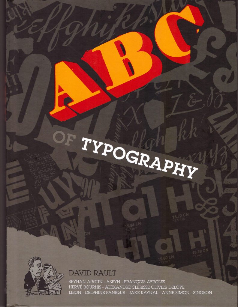
Typography, in essence the style applied to numerals and alphabet, has been with us since the earliest days of writing, and subconsciously impacts on what we assess at a glance. Check the difference between fonts available as you type for an indication of variety. Given comics is such a visual medium it’s surprising that typography hasn’t been investigated before now, and in his introduction David Rault asks why, then proceeds to explain in a book that’s extremely enlightening up to a point.
Rault begins with the origins of writing, once seen as a gift from the Gods. Most of today’s letters are either angular or only feature basic curves because it was the most practical method for Sumerian inscribers of clay tablets, who began with pictograms, but evolved into abstract shapes. Ink on forms of paper permitted greater use of curves, and eventually the Phoenicians conceived the first alphabet, each letter representing a sound, but with vowels absent for the speaker to insert. Subsequent chapters deal with further history, explaining how and why Roman writing spread around the known world, and how Charlemagne established a standardised system in the eighth century, despite not reading or writing himself.
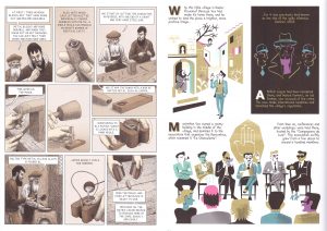
It’s with the invention of Gutenberg’s printing press that the art of typography really flourished, and the history of the man beyond his invention is surprisingly ripe for further investigation, with artist Seyhan Argun (sample art left) illustrating in a style recalling woodcut prints. From chapter to chapter the art varies significantly, echoing the vast differences in typefaces, and the same applies to the uncredited lettering, with a mis-step accompanying Singeon’s investigation of Roman writing and Jake Raynal’s later chapter where the capital C is all too often confused with a bracket. The other sample art is from Alexandre Clérisse who emphasises graphic design on his pages, taken a step further by Raynal de-emphasising almost everything other than letters in service of Letraset and photo-typesetting.
As well as explaining the history of typography Rault delves into many examples, noting the purpose for which they were originally devised, the qualities they represent, and how widespread some have become. The impact of Eric Gill on everyday British life is immense. The typeface he adapted from Eric Johnson’s copyrighted London Underground font was later adopted by Penguin Books for their classic red covers, and the BBC logo, and in the 21st century is ubiquitous on Keep Calm merchandise. He’s also systematic of a frustration about ABC of Typography, which at times devolves into lists. We learn creator names and the font they’re associated with, but little more of their lives. The controversies of Gill’s, for instance, could fill several pages.
Via the chapter illustrated by Anne Simon we learn how fonts are classified, and who devised the system, although Rault’s jokes notwithstanding, this is a little dry, while the final chapter attempts to distil the explosion of fonts in the computer era. However, there are times when Rault, already author of several weighty books on typography, may be too close to the subject, taking matters for granted. There’s no faulting his knowledge, but expanding some aspects would be desirable. Why do people respond so well to certain fonts? Do we really care, or do we just accept a designer’s vision? Rault designates attributes to many fonts, but while they can certainly be symbolic, can they really be virile? What is the process via which designers earn money from fonts? ABC of Typography is a first that will educate and enlighten, but will also raise questions in the enquiring mind.


