Review by Graham Johnstone
Drawn & Quarterly’s Showcase anthology does what it says – allows less known creators space in a durable publication, enough for a graphic novella each. It’s a typically laudable, if not obviously commercial act. It’s printed in colour, though each story here uses only two colours.
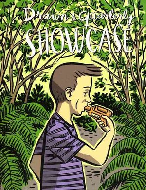
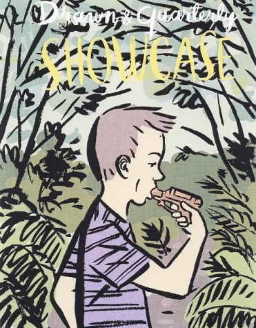
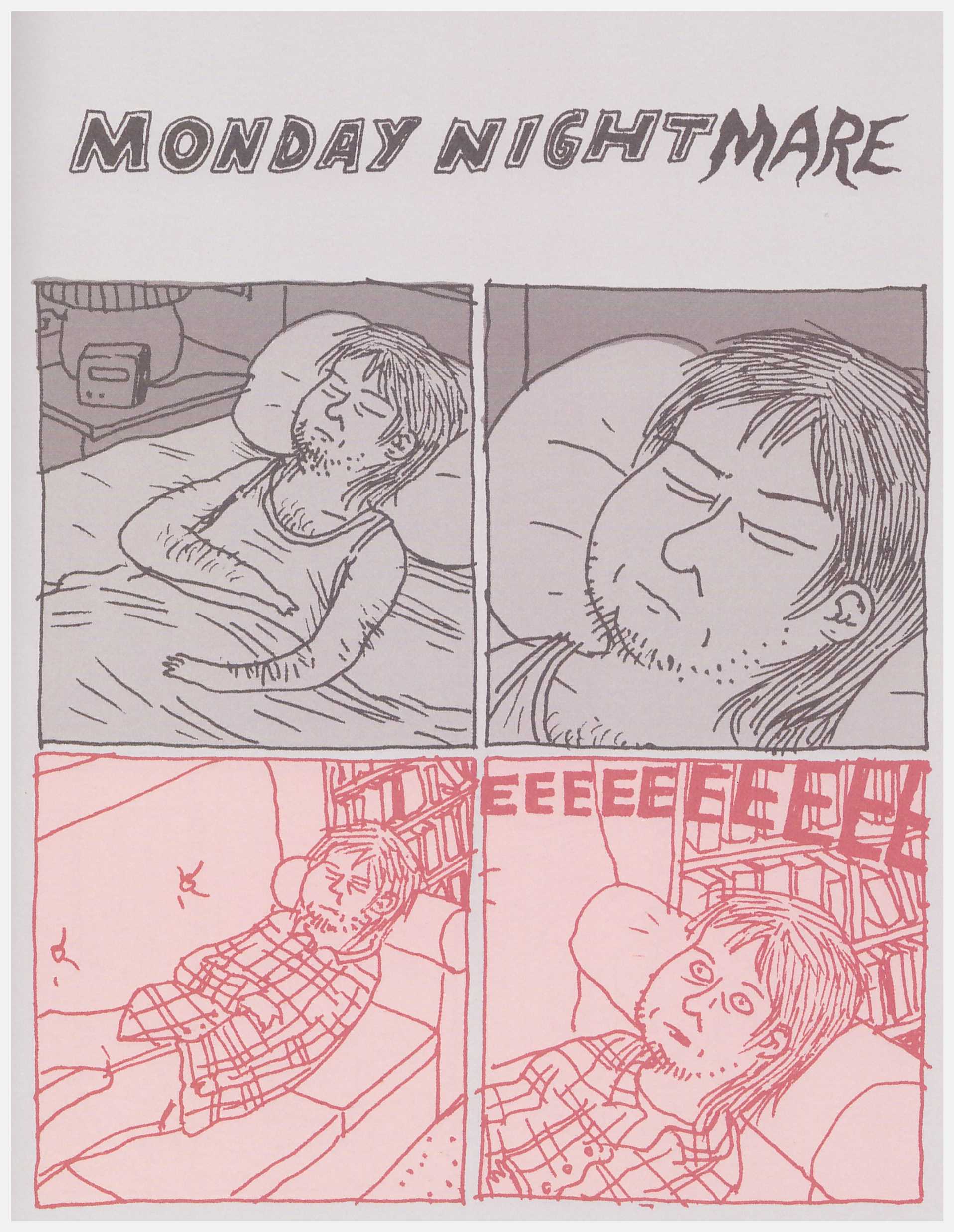
Jeffrey Brown (featured illustration) was then just starting his career, but already known for his unfussy, direct style and matter-of fact autobiographical content. His story though, claims to be based on actual, and significant, events. The adjective ‘cinematic’ is overused in relation to comics, but Brown’s have an affinity with low-fi indie films. One can imagine him like, say, Lars von Trier and the Dogme group, having a list of rules for what he won’t do. He avoids voice-overs in the form of narrative captions, and thought bubbles, relying purely on dialogue to tell us what’s happening. We experience the central, tragic, event mostly through ‘Jeffrey’ and those around him – we only know what they see and discuss. The dialogue and his depiction of the characters reactions, carry the story. Athough it’s perhaps somewhat engineered at the end to give us the full off-stage story.
Finland’s Pentti Otsamo supplies what seems like a slice of life story, but develops into something more intricate. Over the course of a single day, we orbit two apartment buildings. There’s a mother and child after a divorce, a single comics artist, children whose activities revolve around various animals: a dead squirrel, a bird stuck on a balcony, a pet cat, some ants. The connecting theme seems to be the food chain – not just among the animals, but also the way the kids are forever assessing those around them – deciding if they can bully and taunt them. It’s further apparent among the adults, as the artist recognises his new neighbour as a girl who mocked him at school. It reads like the start of a longer work, and like Brown’s contribution, it’s all told without captions.
Erik de Graaf from the Netherlands, is a graphic designer who came late to comics. At fifteen pages his piece is the shortest here, and the slightest. It’s a story of a young boy’s visits with his grandparents on their farm. In contrast to the others, most panels have a terse caption, as the boy tells us the story. What’s a shocking revelation for the boy though, won’t be for many adult readers. Still, it’s an early work from him.
Looking at this a decade later, it seems to show the development of indie comics visual styles. Brown’s cultivated naiveté has elements of Chester (no relation) Brown and Gary Panter, though it feels authentic. Otsamo though draws in a – possible computerised – brush style, that’s slightly mannered and smoothed off. Artists like Chris Ware (a major new influence on the medium at this time) assertively make a feature of this, but Otsamo’s pages hang awkwardly between realism and stylisation. This rendering style combined with the two colour effect is almost too much of a period orthodoxy for indie comics. This is even more the case with de Graaf’s already slight piece, the art is even more stylised and smoothed off, to the extent that faces resemble emojis. Brown though, does make restrained but effective use of the second colour to enhance key scenes.
Anthologies are, by definition, a mixed bag, and possibly a hard sell in this relatively expensive format. Still, it’s a laudable initiative, with some interesting work.