Review by Frank Plowright
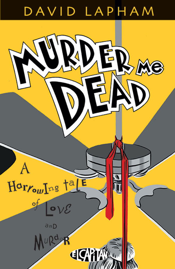
David Lapham was about halfway through his acclaimed Stray Bullets run when he began work on Murder Me Dead, and decided to publish it separately as it couldn’t fit his Stray Bullets ethos of presenting a complete story in every comic (although they fit into a bigger picture). Having made that decision, he also departs from the eight panel grid rigidly applied to Stray Bullets.
The story opens with the seeming suicide of Eve Croft, daughter of a wealthy family and married to restaurateur Steven Russell. He’s the focus of Murder Me Dead, a morose man, and suspected of arranging his wife’s death as he’d benefit financially. His wasn’t a happy marriage, but police rule out foul play, and shortly after Steven begins thinking about the girl he loved in high school. Tara’s now also single again after her husband died, but she’s a woman with a past and a problematical present.
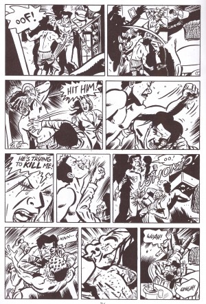
Murder Me Dead is characterised by the accomplished manner Lapham rolls out his noir plot. There are no narrative captions or thought balloons, so readers have to consider which cast members are telling the truth. Lapham’s excellent art helps with this. Strong visual characterisation is a priority, and the expressions Lapham painstakingly creates are the true character guides. Another wonder of the art is the fight scenes. Yes, these are as common as staples in almost all comics, but few people choreograph them as well as Lapham. Several pages of the fourth episode are the equivalent of the familiar film sequence where two men batter each other as a woman screams in the background. Lapham’s presentation of the sheer brutality is brilliantly conceived, and his style ensures there’s no stiff and awkward figures as it occurs.
While set in the 1990s, Lapham infuses the story with imagery suggesting the past, reflecting the noir element of his plot. Cars, locations, and clothing are all deliberately styled to provide a timeless air, and this strong visual cohesion goes a long way to bolstering the plot. Several different settings in which crime dramas are played out occupy the middle chapters. This switching of locations works, but despite one question hanging over almost the entire proceedings there isn’t a great deal of mystery about Murder Me Dead. The strength instead lies in viewing the compulsive downward spiral of addiction. Everything works to a greater or lesser degree until the final chapter. By this time the art shows Lapham’s having problems with deadlines as it’s looser and the layouts not as well considered, with a leap into two panels a page for the big revelation sequence a decidedly misguided choice. This is over-extended and over-emphasised, and despite the horrific circumstances it drags. It’s inexplicable as Lapham’s storytelling instincts have been a cornerstone of his career, yet he deliberately slows what should be a headlong rush into a crawl to the finish line. The plot is sound, but the presentation kills it.
An ending that’s weaker than it might have been doesn’t diminish the overall quality as Lapham visits a place where there are no winners, and is seemingly himself affected.
