Review by Frank Plowright
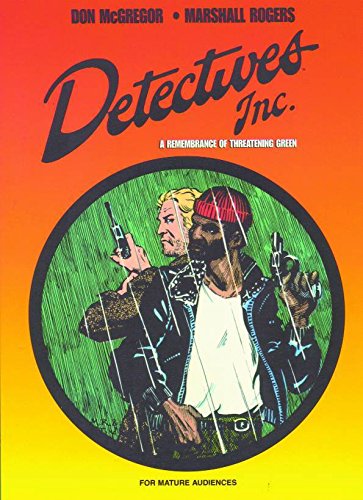
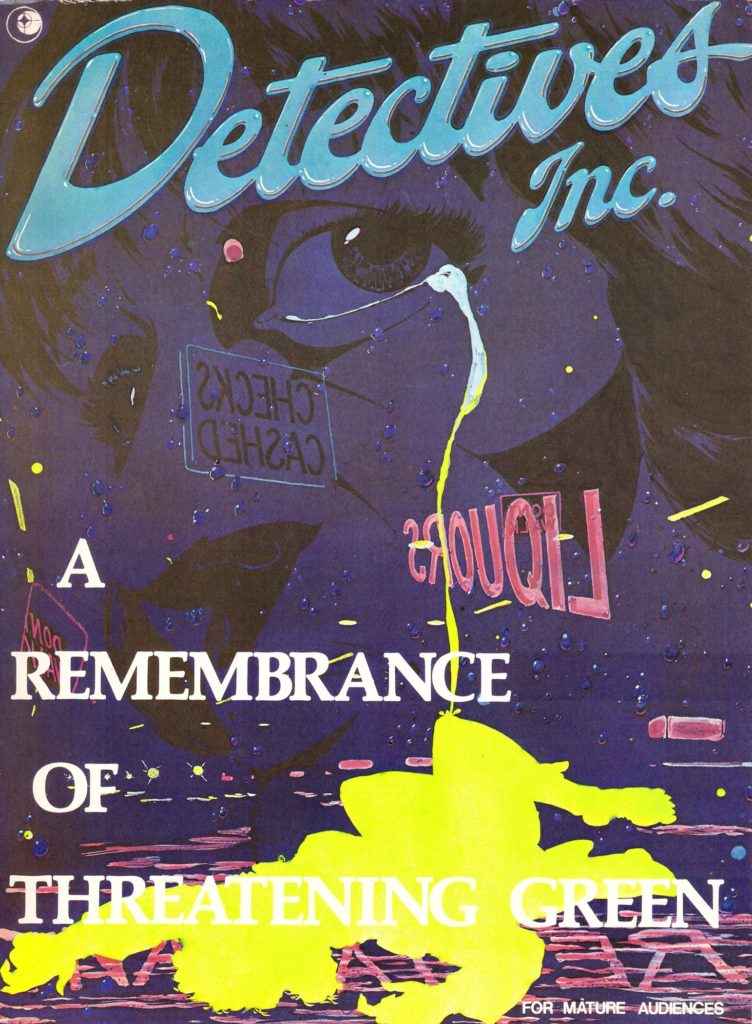
Don McGregor was a unique writer at mid-1970s Marvel. Florid certainly, but someone who invested his cast and their lives with a depth beyond his contemporaries. Under McGregor the trashy pulp SF adventures of Killraven were transformed into a series with pathos and conflicted characters, and his Black Panther featured what would now be labelled world building on a scale not previously seen at Marvel. Unfortunately, then as now, sales determined all, and despite the consistent praise from a minority, McGregor’s heartfelt work didn’t sell. He was, however, fortunate to be a lauded creator with an adult following just as new publishers sprung up to service the growing number of comic shops in the late 1970s and early 1980s. So was artist Marshall Rogers, who’d just completed a phenomenal run on Batman where his mixture of stylish design and 1940s comic influences had won awards. In theory two creators unshackled from commercial imperatives ought to make A Remembrance of Threatening Green still something to set the pulse racing. It isn’t.
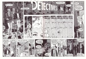
The semi-Proustian title alone indicates McGregor crossing from ambition to pretension, and his methods are utterly misguided. He’s trying so hard to experiment with technique that it clogs the arteries of the story he’s telling. Detectives Ted Denning and Bob Rainier are introduced over the sample opening pages. McGregor aims for the type of banter Quentin Tarantino would later write so effortlessly for cinema to establish personalities, but it’s leaden, reading as dialogue, not what people would say. Even allowing for their being unusually reflective types, on so many occasions the story grinds to a halt because you’re taken aback by their unlikely dialogue, and that’s before the overwritten captions.
If McGregor disappoints, what about Rogers? If anything he’s worse, as there’s not even the fundamental foundation to back up his stylistic priorities. On the left of the sample spread are our two detectives. To be fair to Rogers, as absurd as they now look, in 1980 he’d paid attention to fashion and their appearance was preferable to the creation of an artist who’d not looked out of their window since 1943. However, the detectives have no weight. They float on the page, are poorly proportioned and Rogers has great trouble with perspective throughout. Open any page at random and some glaring artistic error leaps out: strange bendy cars, people with elongated necks, interesting viewpoints scuppered by poor execution…
Nothing improves as the story continues. Ted is tortured because he had to kill to save a life, and Bob is tortured because his wife left him, which is no wonder given the arse that he is, McGregor’s captions involving inner thoughts about his lesbian client. She and her dead friend are superbly attractive, or at least that’s what Rogers aims for, complete with exploitative having your cake and eating it images to accompany the supposedly sympathetic text. Strip away the window dressing and the melodrama predominates. No-one is capable of a reasoned reaction, Ted only requiring a bottle to become the full cliché, and when the culprit and motivation arrives it just reinforces the entire shabby tone. Crime graphic novels are now commonplace, so even that novelty is removed.
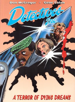
McGregor was trying to bring something different to comics, but time has been extremely unkind, the dabbles in gender attraction almost neolithic now, and the art a millstone. Will McGregor with Gene Colan on A Terror of Dying Dreams read any better? Alternatively, both were combined for the 2009 hardcover Detectives Inc.
