Review by Graham Johnstone
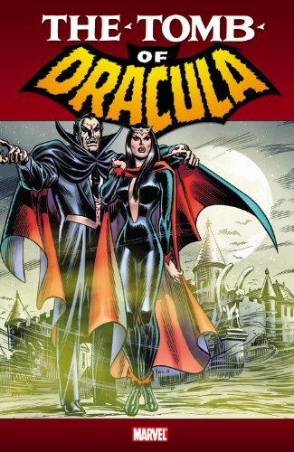
Marvel’s 1970s Tomb of Dracula run is collected in colour here and in two oversize hardbound volumes, and in the Essential series in budget black and white. This volume collects issues 13 to 25, plus two crossover stories, each with their original cover art.
It’s all written by Marv Wolfman, who draws on Bram Stoker’s novel more than the movie versions, and updates the scenario with the descendants of Stoker’s characters, as they clash with Dracula across Europe.
It was bold for its depiction of Dracula’s cruelty, and the view from the glowing red eyes of the antagonist. He’s a ruthless and vengeful individual pursing his own often mysterious goals, but does follow his own code. In ‘Death Rides the Rails’ hearing an apparent attacker behind him he turns to find “…a child, how close he came to my lashing out at him…“ He is reminded of his own children long ago. This doesn’t, however, stop him feeding on the mother, though not enough to kill her.
Sometimes, stories are told from Dracula’s perspective, as in ‘Fear is the Name of the Game’, which is in the form of his journal entries. This provides some fragments of backstory, conveniently taking us up to where the first volume began. We also find out more about Dracula’s abilities: hypnosis over humans, and command of rats and wolves.
Classic gothic themes and characters are presented, but always with believable human stories. Fundamentalist preacher Josiah Dawn thinks Dracula brought back from the dead will swell his congregation: it does, but at a cost. In ‘Return from the Grave’ a skeleton kills a woman and pursues others, or so it appears. The scientific strand of gothic is represented by a sub-plot about Doctor Sun – a scientist ‘recruiting’ and training vampires. This slowly builds towards resolution in the next volume. Wolfman skilfully slips characterisation into the action, his narratives notable for ensuring even Dracula’s passing victims are people with a story we can relate to.
The art team of Gene Colan (pencils) and Tom Palmer (inks and colours) work brilliantly together, creating an impressionistic realism that defined the series. Their Dracula, cape billowing in all weather conditions, is so much more convincing than the prosaic man-in-a-tuxedo of the movies. They also render convincing locations as we move from London towards Transylvania.
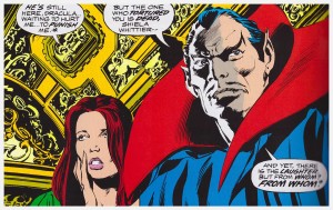
It was rare in the 1970’s for inks and colours to be the work of a single person, and Palmer was one of the best. He used colour for mood and focus rather than aiming for realistic colouring of every object, and it’s still impressive today. In the last panel on page 62, he’s used a pale yellow to pick out the two struggling figures, split as they are by the pale blue of the pillar. He uses different shades to subtly represent the fore, middle, and background of the grand building. Ironically, though, the better reproduction here makes the colours often too saturated. This is most jarring on Dracula’s clothes – his blue suit/cloak with the red lining was never this lurid on the original newsprint.
The inclusion of the crossover stories is welcome, although the art doesn’t reach the high standard of the rest, although it’s fun to see Colan and Mike Ploog render the other’s characters on the Werewolf by Night crossover. Frank Chiaramonte’s inking Colan on a Lilith story are competent, but highlight just how much Palmer adds.
This is one of the high-water-marks of 1970s mainstream comics. The stories and particularly artwork remain impressive, despite some niggles about the colour reproduction in this volume.
