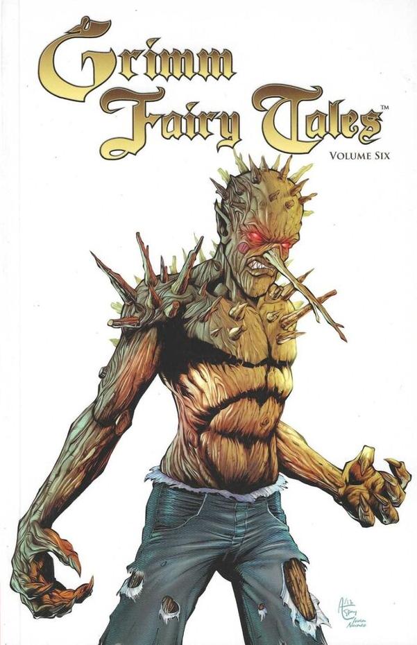
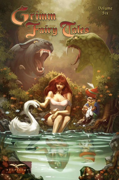
Review by Frank Plowright
While acknowledging enthusiasm and effort on the part of artists very early in their careers, Grimm Fairy Tales doesn’t achieve its potential because their art has rarely been of a professional standard. That changes here.
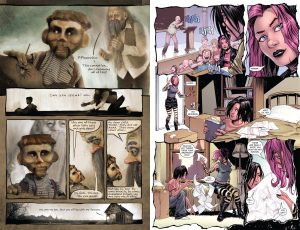
David Seidman writes and draws his contribution twisting the story of Pinocchio. His art is a chasm away from anything seen in the series so far, and by some distance the best seen on Grimm Fairy Tales to this point. The status quo has been a form of figurative illustration, whereas Seidman’s pages are far more representational, with blocks of text accompanying individual mixed media pictures. It doesn’t always work, but the innovatively disturbing artist Seidman became is already evident in places. Growth is also visible, with the later pages being more ambitious than the initial art. It’s coupled with Dave Hoover’s very acceptable naturalism as parallels are drawn between the horrific conversion of schoolboy Jason in Ralph Tedesco’s ‘real’ world plot.
Dan Wickline writes the following three stories imaginatively, but with diminished success due to art not bringing out the possibilities. Jordan Gunderson illustrates the story of a scientist whose wife is dying of cancer when he learns of a possible cure involving snake venom, but dull layouts scupper the potential. Marcio Abreu’s handling of Ancient Egypt has sloppy figurework, he can’t maintain the look of people from one panel to the next, and you can’t tell the difference in ages between the lead character and her Aunt. Axel Machain is best of the artists on Wickline’s material, although nowhere near the quality of either Hoover or Seidman, his style more consistent and expressions a strength as Oscar Wilde’s ‘Picture of Dorian Gray’ is adapted for modern times.
The final story has Michael Dolce and Jeff Zornow following up on their look at an Ugly Duckling from Volume Five. There’s definite improvement in Zornow’s art, now balancing style and design more efficiently (sample right), as Ted experiences a little more success with women, but Zornow ranks high on the objectification scale. It’s a serial killer chiller, a little out of place in the generally fantasy world, but it works as horror.
Whether Seidman’s leap into the unknown is an anomaly or a hint of things to come remains to be seen, but it makes this volume worth picking up. The first eight volumes are also combined as the Grimm Fairy Tales Omnibus.
