Review by Ian Keogh
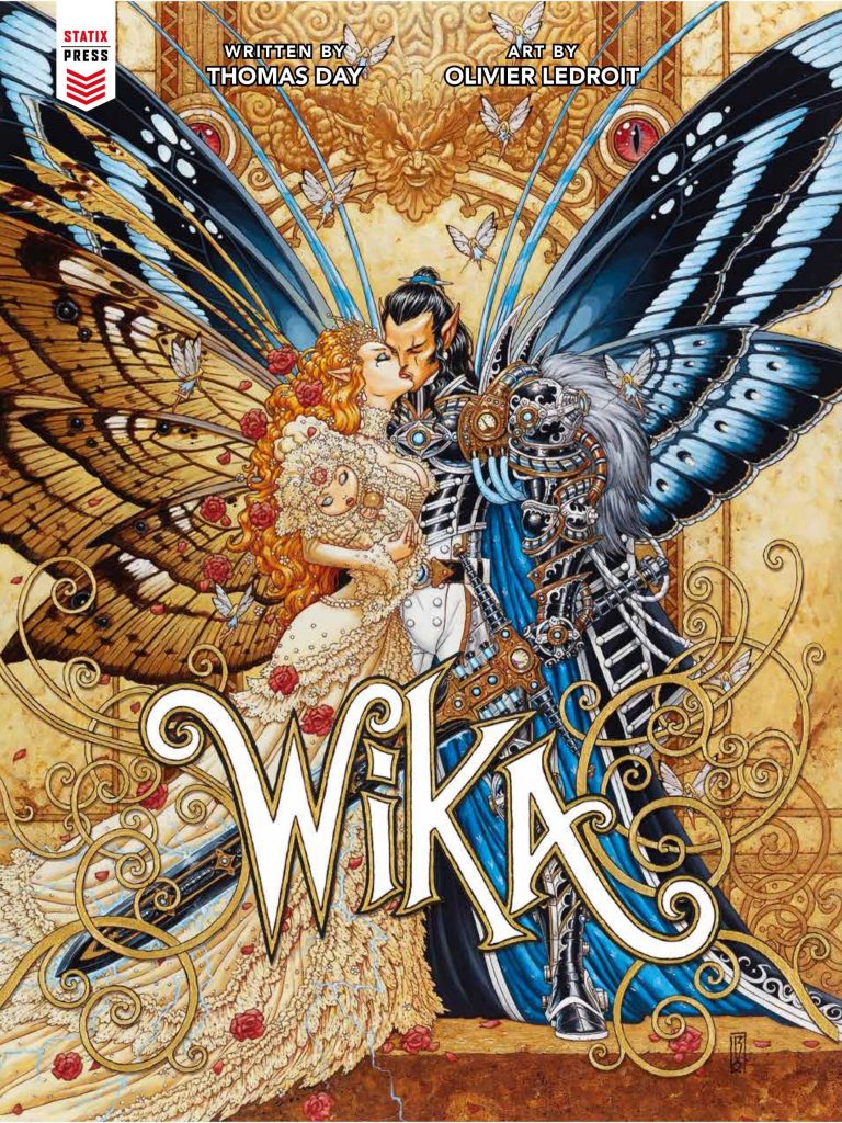
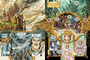
Wika is named after the daughter of the couple murdered in an opening scene leaving us in no doubt what’s to follow. It’s a gruesome start in a fantasy land, with the villains of the piece relishing their ability to indulge their depravity, yet drawn with mind-blowing detail by Olivier Ledroit, who leaves barely any blank space. It’s simultaneously impressive and hard on an eye that doesn’t know where to land.
Thomas Day – Gilles Dumay on his birth certificate – filches his character names and attributes from all sorts of ancient myths, fairy tales and literature, but the basic thrust is that the fairie Oberon is intent on wiping out others of his kind. He rules with an iron hand, and as he’s an unpleasant sort his land reflects his personality. Wika survives the family massacre thanks to a kindly servant, and tips up in Avalon at 14. By the time she’s 17 she’s been taught to become an expert thief, and she later learns other techniques from those with a vested interest in overthrowing Oberon.
It’s dressed up with gratuitous nastiness that at times drops it into horror, but otherwise there’s little about Day’s three act plot that isn’t standard. Seasoned fantasy readers will be able to predict almost every turn of Wika coming of age and avenging her parents over what was three volumes in France, which leaves the selling point as Ledroit’s massive visual imagination. Contemplating just how much time he spent on the detail is mind-boggling, and it’s no wonder the third volume of this trilogy appeared a full five years after the first in the original French editions. Perhaps the true wonder is that it was only five years. If the design-led locations, characters and costumes weren’t enough to occupy Ledroit, Wika has a set of constantly changing tattoos. She, and other people, are very stylised, and women generally objectified, but there’s page after page of wonder making Wika one of those series where the art’s so good it transcends the mundane plot. Almost unbelievably the longer the story continues the more ornate and complex the page designs become. Take a look at Ledroit’s sample art and you’re going to want to see more.


