Review by Woodrow Phoenix
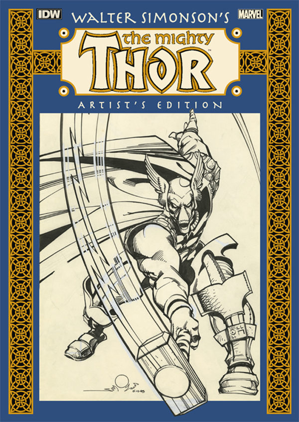
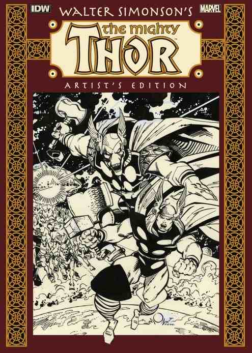
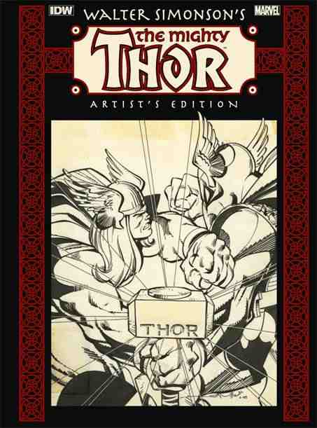
Walter Simonson’s The Mighty Thor: Artist’s Edition presents seven complete issues of original artwork drawn during Simonson’s 1980s run on The Mighty Thor. These include the pages for the first story arc that introduced Beta Ray Bill in Thor 337–340 and the art for the conclusion of the Hela storyline, issues 360–262.
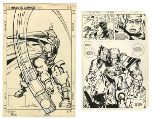
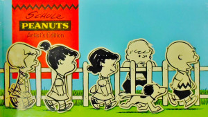
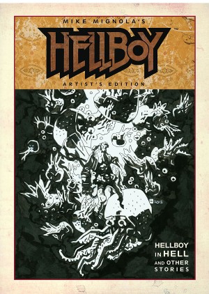
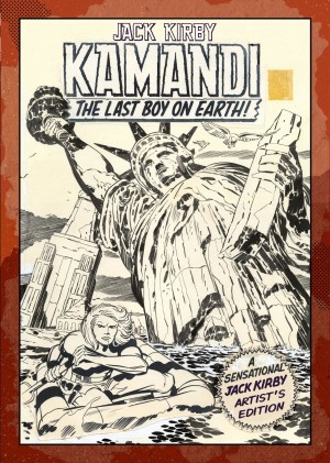
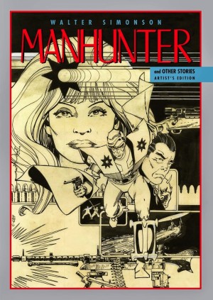
The Artist’s Editions series of books from IDW present exact reproductions of original comic art pages. Each sheet of bristol board, watercolour paper or other large page of pencilled and inked drawings is photographically scanned in colour at very high resolution and reproduced actual size, on heavyweight paper. This produces the sensation of looking at original drawings exactly as created by the artist, with all the pencil marks, corrections and other artefacts visible. These handmade traces are usually hidden when printed at reduced size, so it’s a very different experience to look at comics art in its raw state. Any page of hand-drawn or hand-inked art is interesting to view if you’re curious about how artists work, but when the art is as accomplished and as exciting as these pages from one of the definitive Marvel comics series of the last fifty years it’s hard to not wig out at how amazing The Mighty Thor: Artist’s Edition is.
This book measures 304mm x 432mm and the full size art pages show all Simonson’s inked pencils beautifully, along with paste-ups, corrections and instructions. The lettering is by John Workman directly onto the art so the stories can be read comfortably while examining how it all fits together. There’s a lot to look at in these pages, because Simonson applies the sensibilities of a graphic designer to his comics. His pages are never just panels of attractive pictures, but very carefully composed sequences of images. He draws his own sound effects and he is acutely aware of the relationship between the pictures and the text. Treating lettering as an essential design element, Simonson integrates the sound effects and balloons into his compositions to create graphically sophisticated pages that function like poster art, with lettering that punches, signals and interrupts the images in striking ways. His approach to detail is equally design-led, using patterns, geometric lines and op-art textures instead of conventional cross-hatching. If any pages of comics art can repay close attention, these certainly can. Fans of the original comics will find this collection indispensable.
