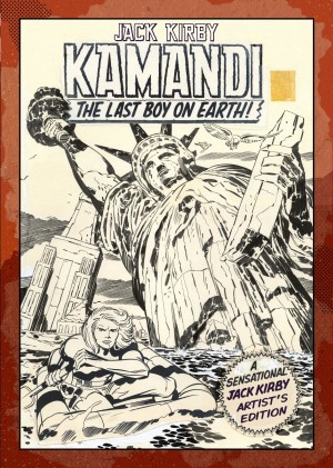
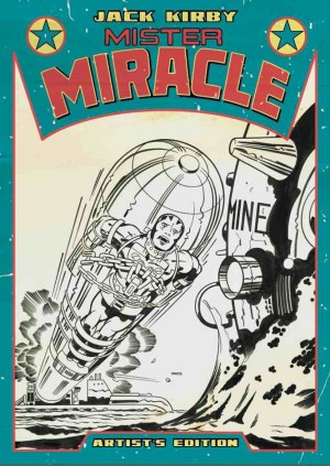
Review by Ian Keogh
Produced in 1982, Silver Star was the final original series Jack Kirby would both write and draw, and there had been no collection when this edition reprinted the story from the stats of his pencilled work. The following year, though, Image issued a hardcover compiling the entire series, so read that Silver Star review for a more plot-oriented assessment.
While the intention may have been to reproduce the entire story from copies of the pencils, many stats of the first issue’s pages were missing, and it’s likely Kirby never copied the spreads, which would have been too large for a 1980s copier. In order that the complete story can be enjoyed, missing stats have been replaced with black and white copies of the inked art.
Even the kindest-hearted Kirby fan couldn’t make much of a case for Silver Star being anywhere near peak work. The ideas never gel, and the art only shines occasionally. In fact, it’s crude in places, explained in John Morrow’s introduction as being due to Kirby’s health problems. Yet he still honoured the commitment for an issue every two months while also holding a full time animation job.
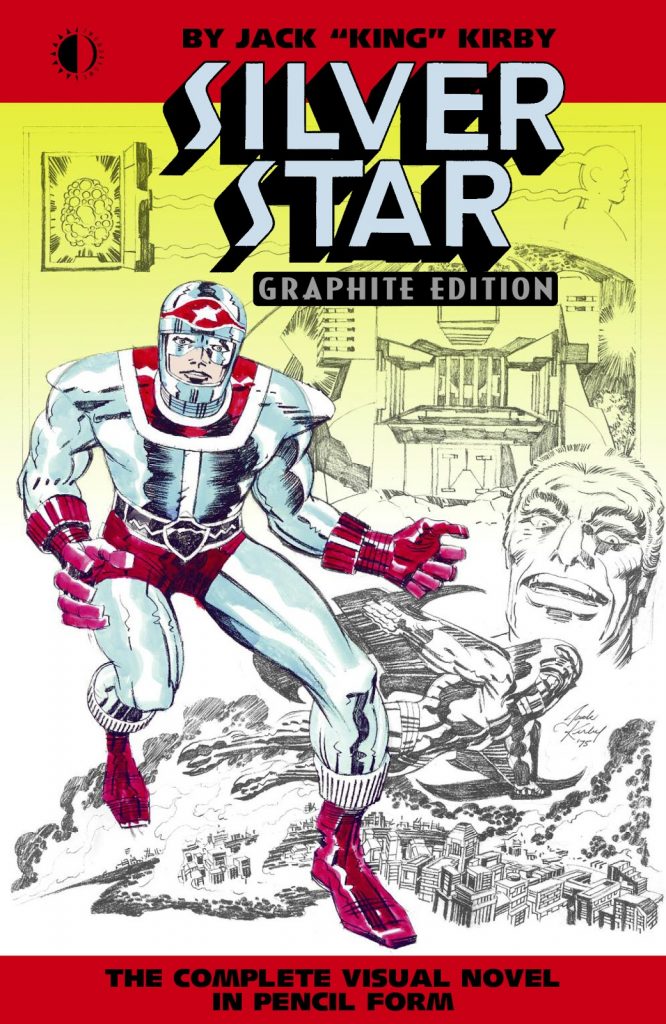
Although it presents the entire story, the Graphite Edition is aimed more at collectors, and they’re well served by a package that not only includes all six chapters and all covers, but anything else connected that could be found in Kirby’s files. Of particular value is the screenplay on which the comic was based, produced with Steve Sherman, and actually filling in some of the character motivation Kirby left out of the comic, or “visual novel” as he called it. Chief villain Darius Drumm is especially fleshed out, but the comic’s ending improves on the screenplay. However, despite the synopsis being produced at the dawn of the special effects blockbuster, it’s easy to see why the expense of transferring Kirby’s vision to the movie screen deterred investors.
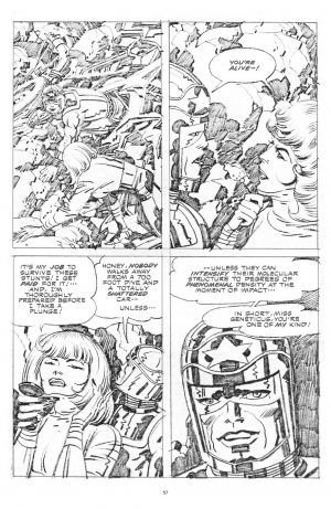
It’s likely most readers will have seen Kirby’s pencilled art from other projects, and if not, many are easily located online, while the recommendations are other collections of original Kirby pages. The surprise is both how tight the pencilled pages are, and yet also how much the inkers Mike Royer and D. Bruce Berry bring to them. It’s more than just adding shade. The pencilled work, though, draws attention to aspects that just pass by in the colour book. The rubble on the sample art is an example, considerable effort put into a panel background, although the inking obviously supplies the depth. Time and again Kirby’s commitment to rubble is apparent. However, the pencils also show the lack of inspiration in places, with cramped layouts and too little variation in order to accommodate the dialogue, much of which isn’t necessary. The introduction explains why this is lettered over the pencilled pages.
This is a very different presentation from the later standard graphic novel, and while the intent is praiseworthy, you’re really better off spending your money on one of Kirby’s many better projects.
