Review by Frank Plowright
Red Light Properties opens with an advertising leaflet promoting a business divesting haunted homes of their malign atmosphere and selling them on. The deception of advertising is highlighted when we meet the cast, who’ve gone to seed when compared with their younger and more glamorous leaflet counterparts. It’s a nice comic touch, and almost immediately subverted as we understand how Jude Tobin experiences the world.
Having begun powerfully, Dan Goldman then sidelines pretty well every interesting element to present half a book of his characters cast whining about how bad business is and how bad their relationships are. It’s an astonishing mis-step. These domestic and financial problems are handled well, but are nothing that can’t be viewed in half a dozen soap operas every day. It’s midway through the book before we see Jude on his rounds, leading to a well developed scene with a Santero practitioner. Even when the more interesting material takes centre stage, though, it becomes apparent that Goldman has no sense of pacing. Everything is extended too long.
The exceptions to this are the brief opening sequence and the brief coda, both exemplary in making their point in compressed fashion. Would that the technique applied to the entire book. Goldman characterises his cast well, and sympathetically, but a cultural element that resonates is financial problems being emphasised at every opportunity, yet when the cast aren’t eating out, they’re having food delivered.
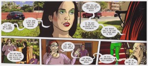
The art is interesting. Goldman is ahead of most of his contemporaries in making full use of digital manipulation technology, not only by originating his strip as a web comic, but by photographing his cast, then transforming them into traditional two dimensional simulacrums. Being able to capture a precise expression adds an emotional weight, although the juxtaposition of comic-style character overlaid onto a photographic background doesn’t always work. It sometimes drags the eye away from the person that should be the central image.
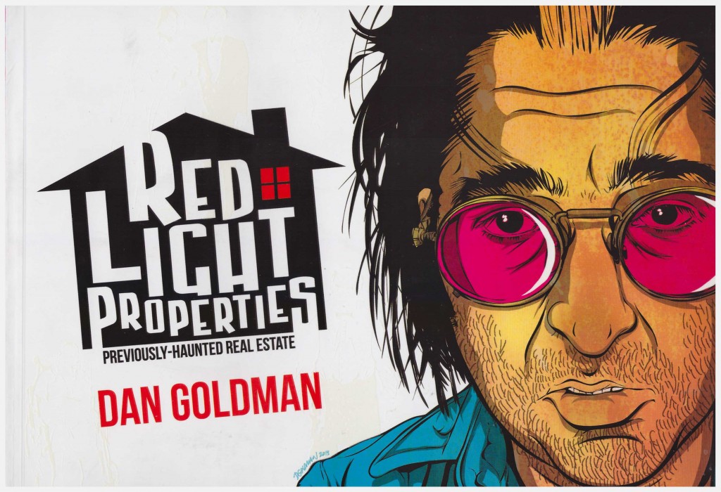
A notable aspect of this landscape presentation is the cover, with its well-designed logo reflecting the theme, and portrait of Jude. There’s a rough feel, however, and closer inspection reveals outlines in a fluorescent substance. Charge them via light bulb, then switch the light off for an experience that reflects the story. It’s a nice bonus, but you’ll have to check the actual book to see it as the ghosts don’t register on scanners.
Red Light Properties continues in Underwater.
