Review by Ian Keogh
There’s a dreamlike quality about Something City, as Ellice Weaver acts as tour guide, taking us around what at first appears a generic town, introducing us to the inhabitants and spending a little time in their company. We drop in on the nudist colony, the Amish enclave, and the animal rights activist among others.
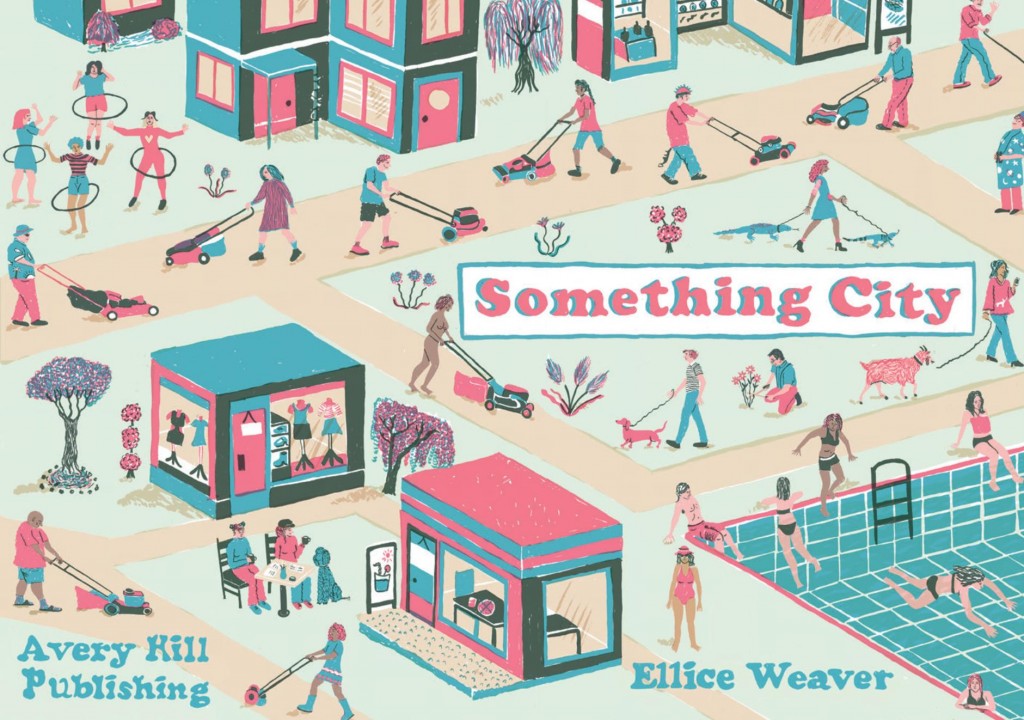
The sardonic intent is well represented by the cover, with the uniform activities and the parade of lawn mowers. The view from above employed here and several times inside could suggest that from prison towers, or hint at a vast social experimental community. In fact a prison is among the venues visited, the opening illustration little different from the cheery activities on view elsewhere. It’s one of the episodes playing heavily on fantasy delusions, a recurring theme as people attempt to shape the world to their desires.
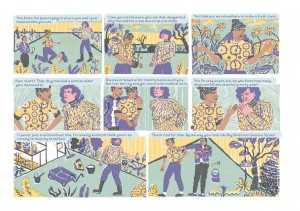
Would you want to live in Something City? Ultimately not. Beyond the town itself, the theme connecting all stories is that of someone either running away from something or hiding from something, be it condemnation, the outdoors or their own mortality. Weaver presents this via entwined snapshots in which some characters recur, their connections clarified by a diagram ending the book. Discontent is the prevailing mood, with no-one really happy with their circumstances, which rather plays against the idyllic introductory pages to each tale.
These are simpler versions of the complex flat townscapes Eboy have used in design and advertising. They’re wonderfully constructed, presenting the essence of each story’s background while offering glimpses that inform what follows. Beyond that the art is very deliberately styled. Both the two-dimensional aspect and restricting the colours to three per story in addition to black and white could be seen as reflecting the limitations of urban society, or maybe that’s reading too much into what’s essentially a peek into lives rather than any kind of judgemental commentary. Something City works as either.
What it works best at is defining character. We can understand what everyone is going through, how this affects others, and what prompts their disillusionment. This involvement wrapped in such a decorative landscape package makes for time well spent.
