Review by Frank Plowright
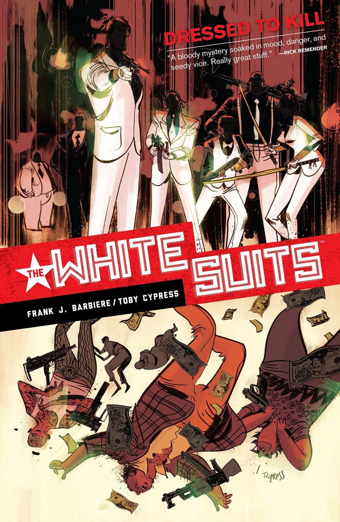
The White Suits are a myth. The White Suits are a legend. The White Suits are real. The White Suits are fearless, and the White Suits are here. Frank J. Barbire and Toby Cypress are dabbling in the style of the Hong Kong gangster movie, where logic and common sense has to be placed on the shelf to fully appreciate the action. We first see the White Suits as they drop through the glass of a gangster’s heavily guarded rooftop pad, avoid being shot by all the henchmen present before killing them, then slicing the hands off the top man. The opening chapter is a style fest topped off by Cypress knocking the art out of the park. It’s chic. He’s great with movement, motion and confusion, designing monsters and mobsters, while picking out the necessary highlights in red. The link to the Hong Kong action movie is cemented by the unknown man with memory loss and the government agent driven by a desire for personal revenge.
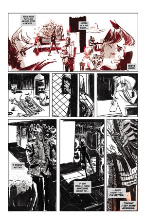
That opening chapter is great. It tells us all we need to know about anyone involved and sets the stage for something great. Sadly the remainder is like a slowly deflating balloon. Barbiere plays all his aces early, and there’s not enough substance to maintain interest as predictable variations on the same scenes play out again and again. There’s barely anything about chapters two and three that the seasoned crime reader won’t see coming, from the child on forward, and not even the art provides a saving grace because Cypress can’t settle into a style. How a page looks seems to depend on what Cypress felt like trying when he started on it, so in places there’s still the kinetic action that works, but there’s also over the top exaggerated cartooning, some nice plain linework, some loose, some tight, and by the end pages that surprise only via being so conventional. Cypress also colours, and having spent most of the book working in black white and red, in the final chapter for some reason he randomly introduces a panel featuring blue. None of the art is poor, but Cypress needed to settle on a style and stick with it.
Revelations in the final chapter have some novelty to them, but go too far into mad villain monologuing, and if taken at face value, failing to connect logically with what’s rolled out earlier. There’s ambition to The White Suits, but beyond the opening salvo not matched by the execution.
