Review by Frank Plowright
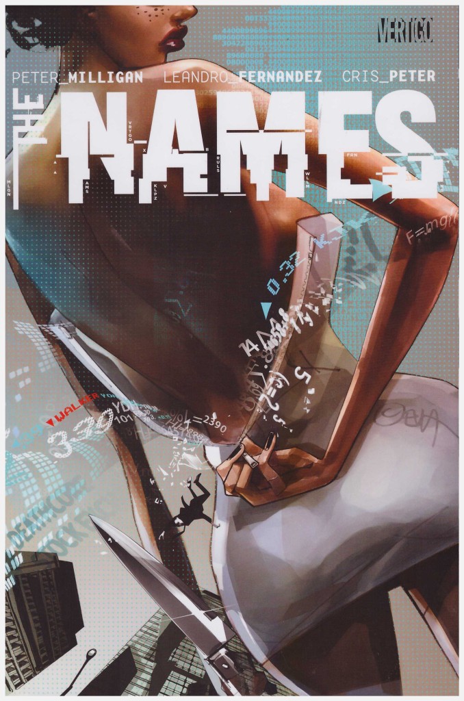
Peter Milligan introduces a clever and intriguing central idea in The Names: sentient algorithms intent on subverting the efforts of corrupt and controlling financial traders. He further impresses by appropriating the real world villains of the day for his story. Only a financial trader loves another financial trader.
Until very recently in that line of work was Kevin Walker, late of this world, having seemingly committed suicide, a verdict his much younger second wife Katya vehemently refuses to accept. Her relationship with Walker’s son Philip, always difficult, doesn’t improve for her being the one to break the news about his father. Philip is never identified as such, but portrayed as on the autistic scale, which aids in assembling clues and making breakthroughs, but has social drawbacks. Together, though, they begin investigating what may have actually occurred.
Definitely involved is the Surgeon, an out of control psychopath with scalpels whose task is to enforce the will of the Names, an elite group of financial manipulators. Unfortunately, for them, there’s a splinter faction, and beyond that the aforementioned sentient algorithms, referred to as the Dark Loops, seemingly intent on creating financial chaos.
There’s the germ of something good here, but when the cast are flung together they fail to convince because on too many occasions a bizarre or inconsistent piece of behaviour services the plot, but doesn’t ring true in human terms. Furthermore, for a project always planned to be nine chapters too much is introduced and ignored, or left unanswered, and from a very promising start Milligan is going through the motions by the end. Even the casual, weary decadence of his dialogue has fallen flat.
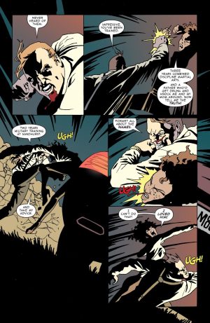
Leandro Fernández is a top notch artist who can vary his approach, but the tack he takes with the cast is plain odd. He’s not aiming for graphic realism, so everyone is sketched to some degree, but both the Surgeon and Stoker have supernaturally long, thin faces with pointed ears. There’s no reason for this beyond stylistic caprice, and it’s extremely distracting. Elsewhere his work with light and shade is good, but dampened by unimaginative colouring from Cris Peter. So many Vertigo titles have their pages slathered in shades of brown or as near as. Why?
All in all, this fails to live up to best of either creator.
