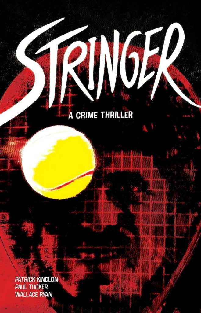
Review by Frank Plowright
Under Patrick Kindlon, the title doesn’t refer to any form of press photographer, but is more literal as Tim strings rackets on the professional tennis tour. This is in 1983, and he has a side hustle of selling drugs, although as seen from the start, he’s mouthy, indiscreet and not especially bright. That’s important to establish, as those qualities ensure a tension hangs over Stringer because Tim is likely to be his own worst enemy when approached by some very threatening people and tasked with smuggling a sports bag filled with cocaine into the USA. This will involve transporting the bag through three separate immigration checks along the way from France to San Diego.
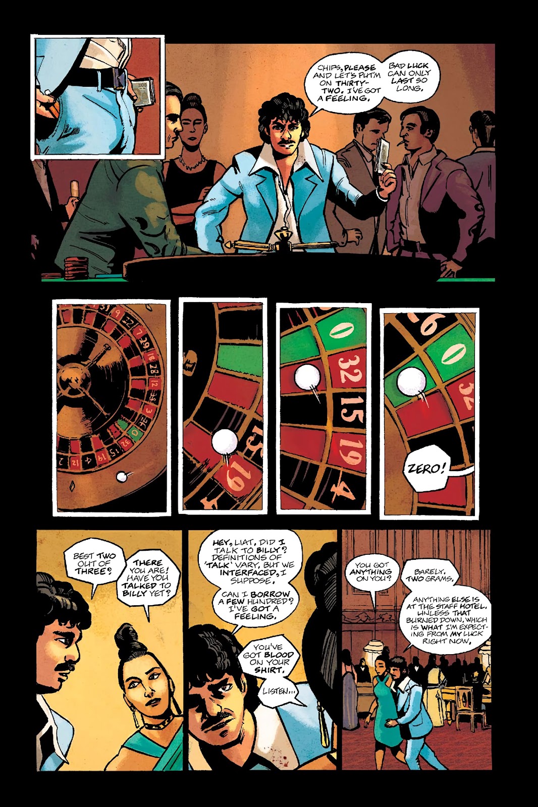
It’s a viable set-up, even if Tim is so unlikeable that no reader is going to care what happens to him. However, it’s not long before Stringer starts losing its way, and that’s largely due to both creators being less concerned with presenting events than with presenting them cleverly. Paul Tucker’s art is strongly designed, but he’d rather prioritise a page that looks interesting than tell the story efficiently. There’s also a tendency to run two conversations simultaneously, which may be Kindlon’s storytelling choice, but it’s a device that’s overused, especially over the second chapter, where Tim’s dialogue crosses over with a Portuguese thug and a more introspective Greek enforcer.
Some readers may admire the techniques, and stick with Stringer, but just as many will surely be alienated by moments almost designed for that purpose. Why not provide a translation of what a French customs official is saying when holding a poorly disguised gun? Why use panels requiring the book to be turned upside down? Why have a character whose English can barely be understood? One or two such devices add a quirkiness, but multiply them and you have something that’s barely comprehensible at times.
It’s a shame, because beneath what’s designed to impress yet actually annoys, there’s a decent comedy caper plot well constructed.