Review by Frank Plowright
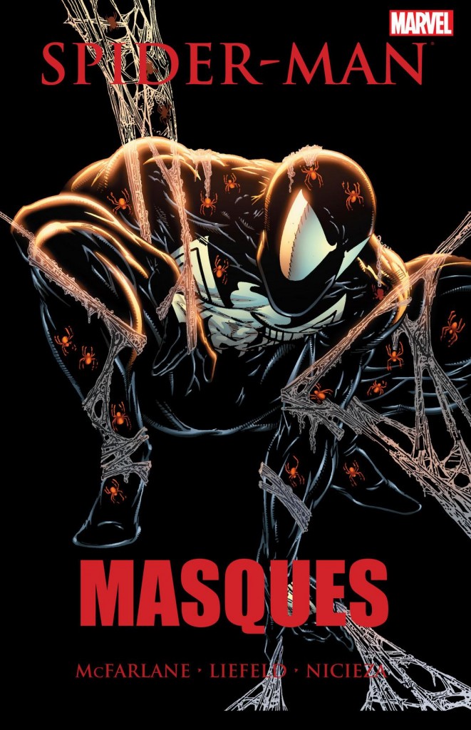
By the time Todd McFarlane began working on the material collected in Masques, Marvel already knew the advance orders for the first chapter of what’s found in Torment, and they were phenomenal. In the face of such success the editorial instruction for what’s presented here appears to have been to let Todd get on with it, and in pure commercial terms that makes perfect sense.
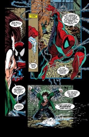
Yet in 2014 we have a new collection of Masques, and it’s unreadable. In 1991 few people were buying Todd McFarlane’s Spider-Man for the story. They were wowed by the art and in terms of lines on the page per cent spent surely no-one in the history of comics has provided better value than the opening two-parter. There are motion lines, impact lines, cross-hatching, lines on capes, lines on faces, lines on motorcyles… All that time spent drawing lines meant McFarlane didn’t have time for too many panels. His opening pages are characterised by four vertical panels, a valid stylistic device, but four panels on a page thereafter are hardly common. It means very slim stories are told in effect by pin-ups. Unlike Torment, there’s a what might have been a memorably disturbing story over the opening chapters, but it’s drowned in incoherence.
Much the same applies to the following tale of the homeless disappearing from the streets. The slim plot is extended by use of large panels, and McFarlane’s script is hardly verbose until an extraordinary verbal dump over the final few pages. It’s as if he’s been allocated a word count and suddenly realised he’s short by 90%.
The novelty of seeing McFarlane’s closing contribution as a tale told in landscape format over spreads rapidly wears off as it becomes clear this is an excuse for him to draw even larger images and contribute even less in the way of story. Spider-Man’s participation is minimal in this crossover with X-Force, the concluding chapter of which is the work of Rob Liefeld (with Fabian Nicieza providing dialogue). Liefeld’s actual storytelling is better than McFarlane’s, with a semblance of panel to panel continuity, but it’s about the only acceptable aspect of Liefeld’s pages. There’s an enthusiasm, but the art lacks any sense of depth, perspective or anatomy. They’re truly, truly wretched.
Kids lapped this up in 1991. Have the scales now dropped from their eyes? The content is also available in the Spider-Man by Todd McFarlane Omnibus, which also contains the better Perceptions, featuring a story originally published in issues between the material in Masques.
