Review by Frank Plowright
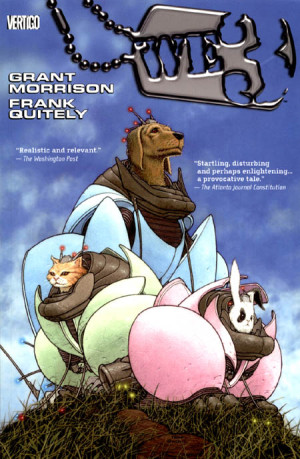
Flex Mentallo originated in Grant Morrison’s groundbreaking Doom Patrol series of the 1990s, created as a parody of the Charles Atlas bodybuilding ads featured in so many comics from the 1950s to the 1970s. In story, Flex was a perfect physical specimen created in childhood comics, but brought to life by his creator’s psychic powers, indicative of the laugh Morrison was having when he conceived the character. The musclebound Flex walks around in leopardskin print underpants and wrestling boots, and whenever he strikes a pose the phrase ‘Hero of the Beach’ appears above his head.
As much as anything Flex Mentallo is about the experience of absorbing comics as a child, with the visuals saturated with references both to the content and the advertising, and superheroes being absolutely necessary as a means of escaping reality. It’s not the only method shown, as Morrison contrasts that with drug use as Flex’s creator Wally Sage, in alternate realities, mumbles away in an alleyway having taken an overdose. As he trips, he recalls the superheroes he loved when younger, Morrison equating each of the four chapters with a stage in their development.
When first released as serialised comics in 1996, Flex Mentallo was innovative and announced the arrival of a fantastic new artist. Its mystique grew over the years when a collection never appeared, sustained by rumours that Charles Atlas had sued DC (read Brian Cronin’s explanation at CBR.Com), when a more likely explanation was lack of faith in the sales potential. Yet by 2012 Frank Quitely was established as an artist of the first rank, and that potential was re-evaluated for this hardcover. In the meantime however, comics had progressed. Morrison has certain features to his writing, one being that a story can always benefit from stimulating visuals, and an easy way to achieve this narratively is to throw in a few pages of surreality. They look great, and he’s always found them easy to write, but resorted to this on so many occasions that what was once fresh is now extremely mannered. There’s also an almost hectoring desperation to the central optimism of superheroes being essential to escape reality. Snippets of story accorded great gravitas by means of bombastically portentous captions are accompanied by what’s still good: Morrison’s prodigious imagination and Quitely’s stunningly elegant art. In the case of the former, the creativity of the sheer dazzling cascade of ideas, which ought to be thrilling, is undermined by their being tossed into the pages, then orphaned and unexplored.
Quitely’s art would develop further very quickly, and he’d collaborate with Morrison on projects that have aged better, but his delicacy and great designs shine here as well. Required to create a few dozen superheroes and villains he does so impressively, but his best design is the police lieutenant who anchors the story. Memorably overweight and balding, he’s the everyman whose cynicism is supplanted. There’s barely a page where there isn’t something that catches the eye, and as such Quitely goes some way to symbolising Morrison’s central point about superheroes being essential. Morrison deals in concepts, but concepts depend on realisation, and sadly not all artists are Quitely.
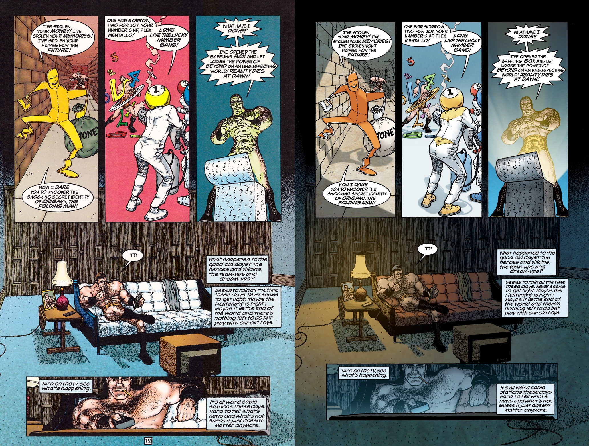
For republication the entire story was recoloured. The flat vibrancy of the original comics has been replaced by Peter Doherty’s toned down shades of grey and brown. It can be justified as reflecting the theme of superheroes being downplayed, but it makes for duller pages, although in this interview Quitely notes he prefers the new colouring.